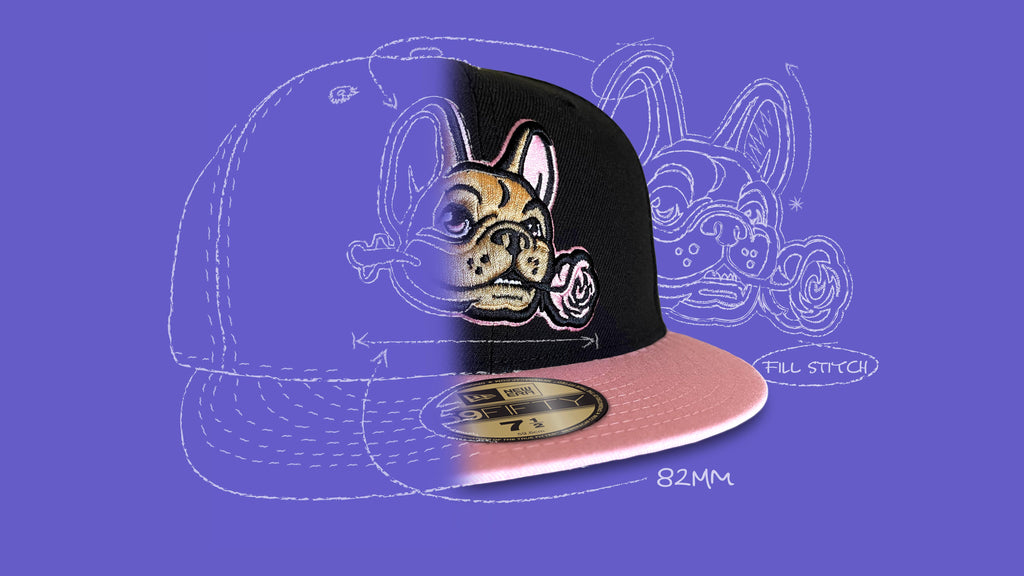
How Clink is made...


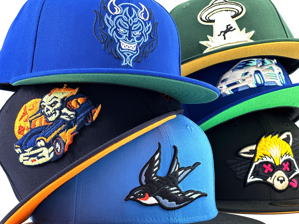
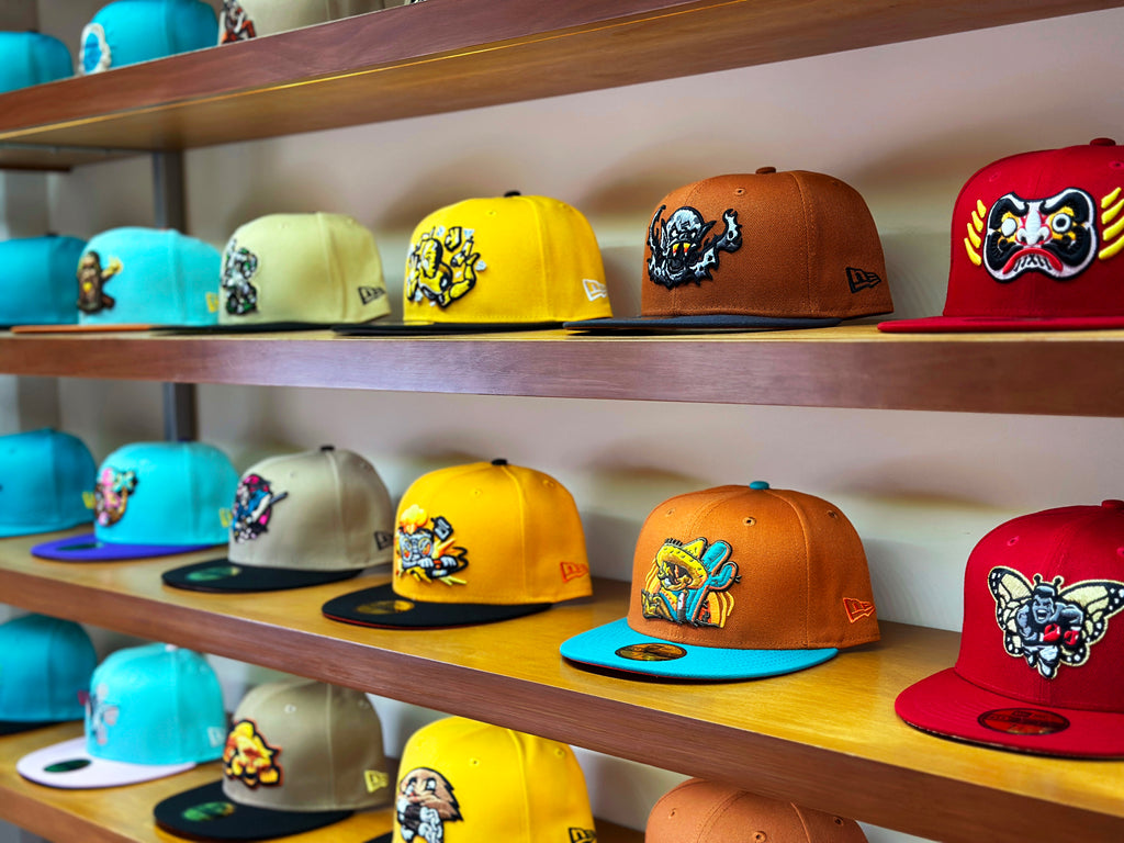
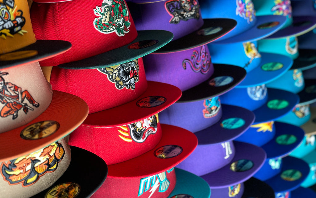
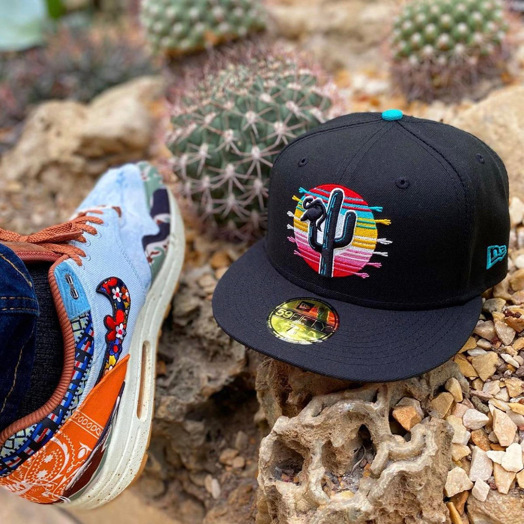
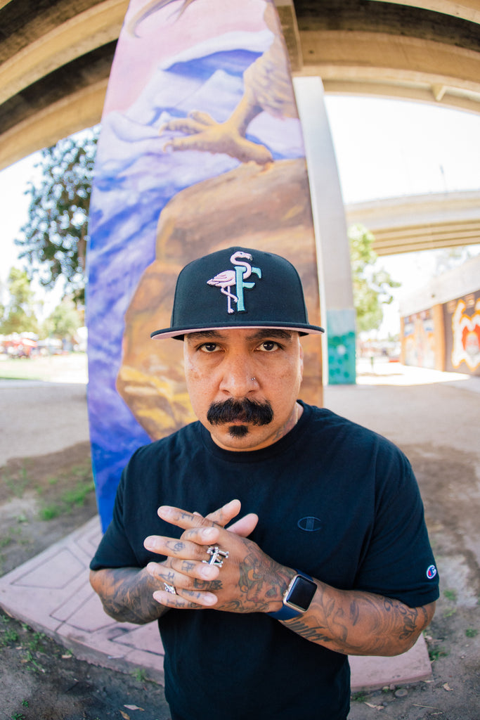
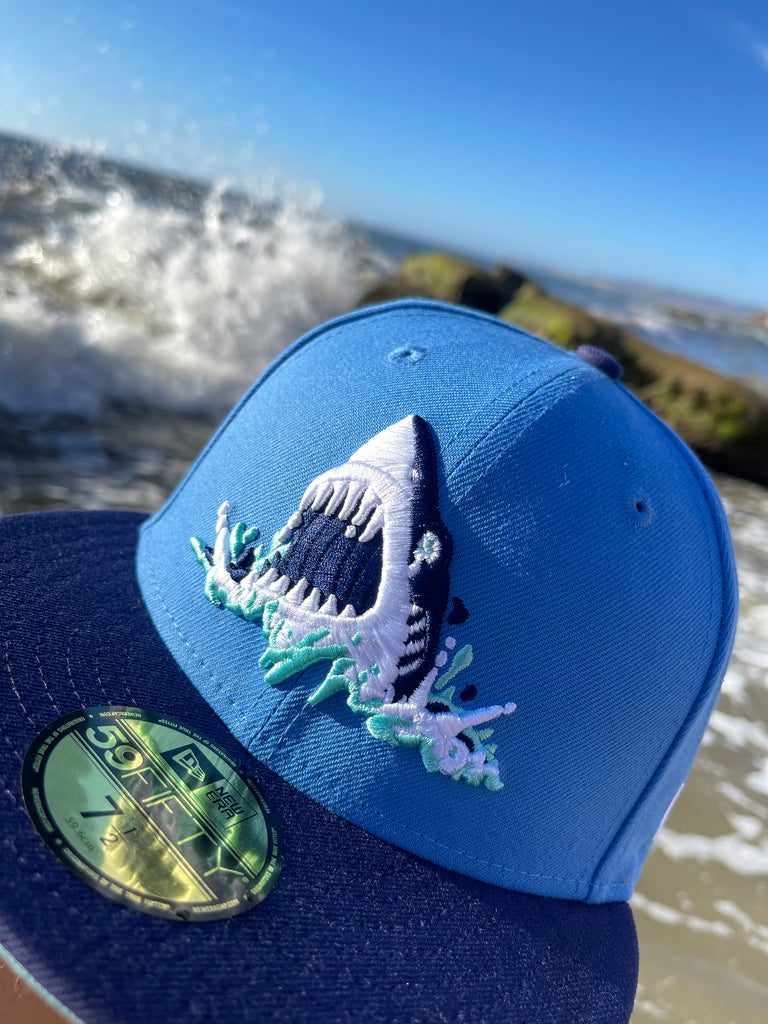
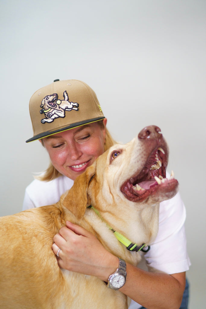
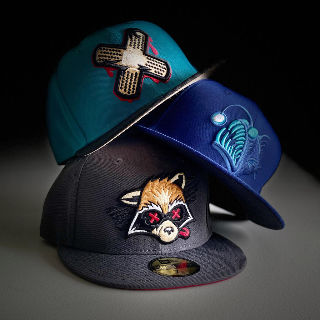
LAST CALL PREORDERS
These designs have less than a week before they're closed for preorder. Forever!


Let customers speak for us


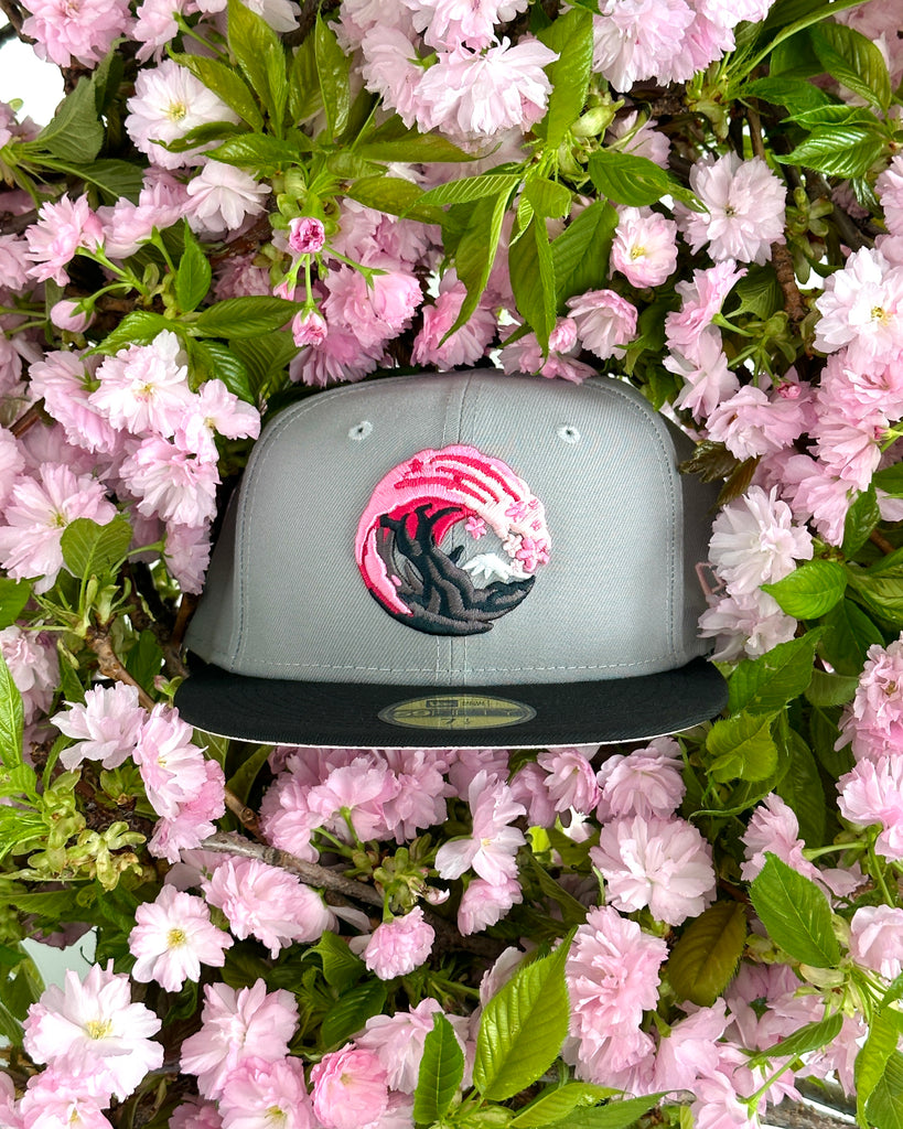
All my Clink caps are superbly constructed. Unique, distinctive, & clever. The conversation starters with the designs are a joy.

High quality patch. Turned out better than I could've hoped. Can't wait for the next custom design that catches my eye.

Wonderful hat! Everything is spot on and great quality. This might be my favorite one yet.


My first clink and it is perfection , keep up the good work .

I love my custom piece and how fast it came! Everything was beyond what I expected! Love it!!❤️💪💯🔥

Awesome fit and quality design. Love the hat and worth the wait on the pre-order

Best Custom so far!! Detail is excellent. The hat pin is the clincher. I appreciate the sticker too!!

Top notch quality hat with the most creative design